Having multiple styles in your portfolio? Then and now

I got an email asking about having multiple styles in my portfolio. That got me thinking about my portfolio journey. Spoiler alert : I think having one style at the beginning of the career is important. But there are ways to show off your styleS. Here’s what I think.

Develop : My style was all over the place.. but that was good

My first job as an artist was being a game artist at an indie games company. Because it was a small company we got to work in various styles. Some of the art was used for a proposal to an investor. Some were used to show the clients what the game might look like. I worked on hideen object games, word puzzle games, arcade games, turn based battle games, kids games etc. And all of them required different look.

So naturally I became “good“ at switching styles. I learned how to listen to clients / art director / team. I asked the right questions so I could better predict what’s in their minds.

Improve : From being a game artist to becoming a children’s book illustrator

So you would think having various styles in my portfolio looks good for children’s book agents and editors right? Um, No.

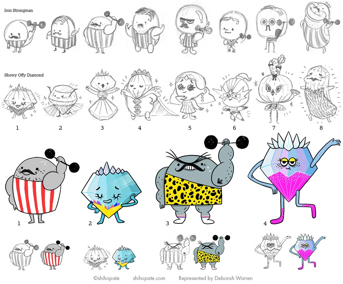
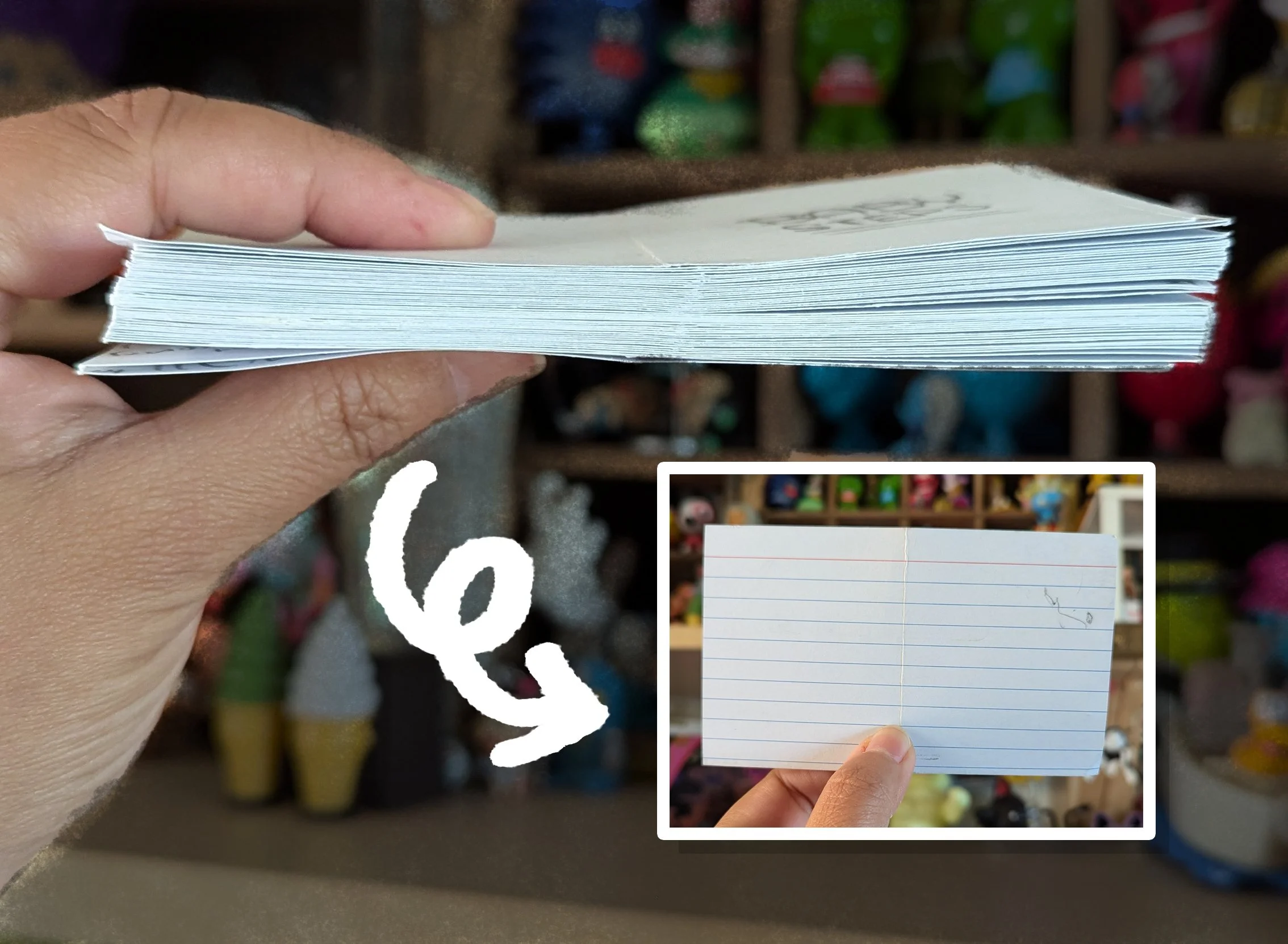
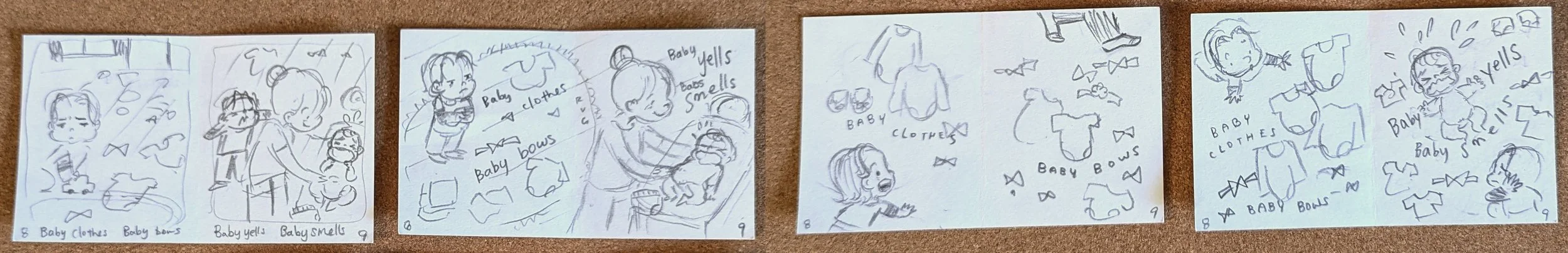
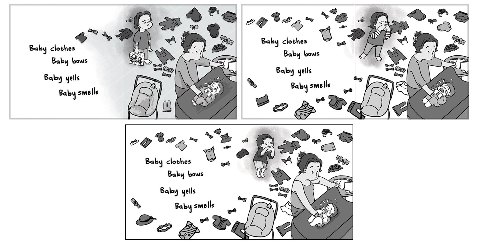
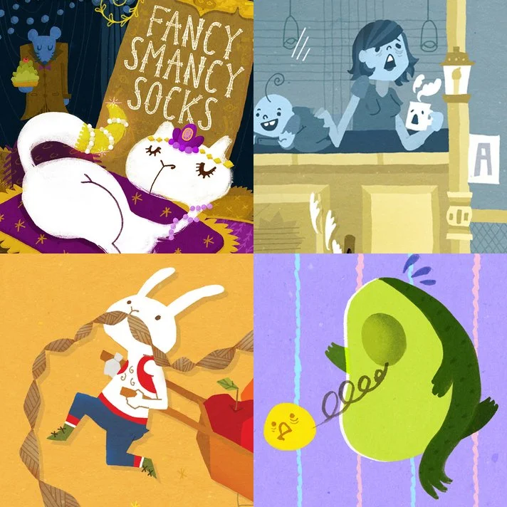
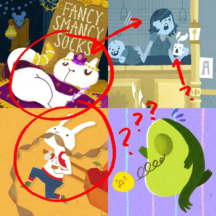
When I started building my portfolio it looked like this → → →

Individual illustration looked ok. One of the illustration got into 3x3 magazine. I was pretty confident. But when I showed this to my agent whom I wanted to be represented by, she immediately started editing my portfolio. Here’s what her concerns were.

  1. Look of the characters were not consistent

  2. Colors were not consistent

  3. It was hard to tell what age group I was illustrating for

  4. There was no illustration in sequence

  5. Some of the stories were not clear

But WHY were these concerns? What made my portfolio BAD?


Let’s think from an AGENT’s perspective.

Agent is the person to represent you. They are the one talking to editors and convincing them to hire you. So YOU are a brand. Your agent needs to explain you (brand) to editors in simple sentences. Just like when you explain brands like DISNEY vs NICKELODEON. If YOU, the brand has no consistency (voice), it’s really hard for the agent to represent you and speak for you.

Let’s think from an EDITOR’s perspective.

Editor is the person to hire you. They are the ones talking to authors, marketing team, budget team etc. So YOU are a teammate. Your editor needs to convince their teammates that you are a good teammate to work with. Editor has to probably put together a pitch packet of YOU and present it to marketing team / budget team / other editors / their boss etc. But if the editor can’t see WHO you are through your art, it’s hard to convince others.


Based on agent / editor’s perspectives let’s review my agent’s feedback again.

  1. Look of the characters were not consistent

    • This means my brand was not consistent. My agent couldn’t figure out how to market me.

  2. Colors were not consistent

    • Again, my brand wasn’t strong and consistent enough. It was hard for my agent to explain my work in simple sentences.

  3. It was hard to tell what age group I was illustrating for

    • Big red flag. Definitely wouldn’t gain editor’s trust because they won’t know what book to assign me to.

  4. There was no illustration in sequence

    • Another reason to lose their trust. How can I create an entire book without showing them that I can draw the same character over and over again?

  5. Some of the stories were not clear

    • If I’m not clear in my visual storytelling, how would I get hired.

So what kind of portfolio gains trust from agents and editors?

Here’s what I would focus on.

  • Find your audience

    • Do you want to illustrate picture books? Middle grade? Young adult? Think of the age range you want to work in.

      • Picture books - usually full spread illustrations and cover

      • Middle grade - usually spot illustrations and/or in black and white and cover

      • Young adult - usually cover art and some spot illustrations

    • Once you decide on the age range, make 10 or so illustrations

    • If you have multiple interest, make 10 or so per audience and create tabs per the audience (one tab for PB, one tab for MG etc)

  • Find your voice / story

    • What is your favorite thing to illustrate about? Is it about people? your heritage? Specific animal? Time of day?

    • What is your tone of your illustration? Is it funny? Goofy? Kind? Loud? Colorful? Limited color palette?

  • Show your skill

    • This could be about choosing your medium. Or the way you illustrate. It could be about how you do the lighting. The person who emailed me about portfolio building had a portfolio full of wonderful glow coming out of the character. I pointed out how beautiful that was.

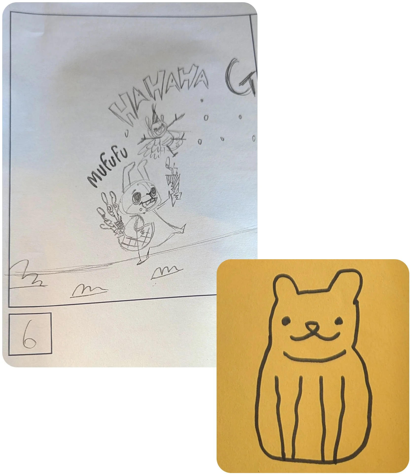
  • Have a sketchbook seciton in your portfolio

    • You have so much more to offer! If you want t showcase your multiple styles that’s NOT part of the main portfolio, add a tab that says ‘sketchbook’ and put all of your joyous styles there! I’ve heard agents and editors peaking in there to see what else that artist has to offer.

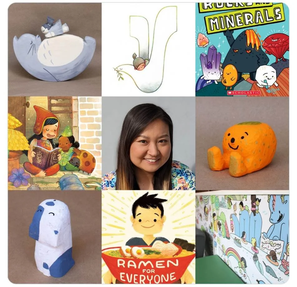
Expand : Adding new mediums (style?) to my portfolio

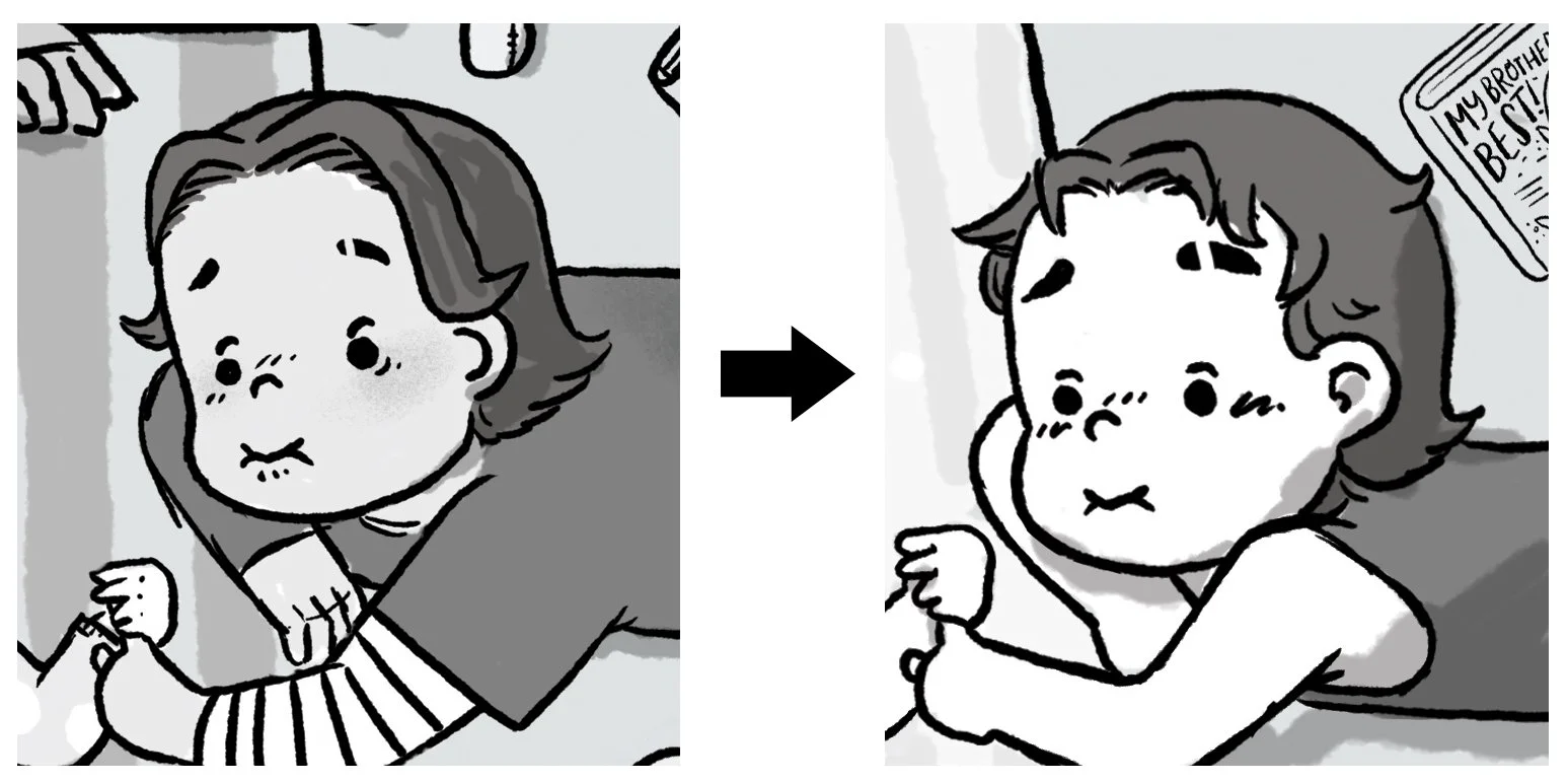
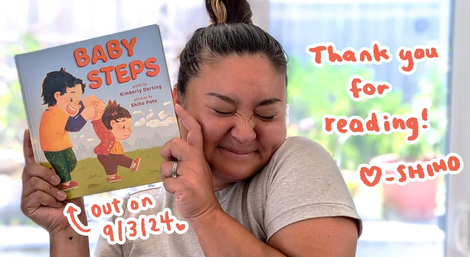
After working on 2 PIRATES + 1 ROBOT (Kane/Miller), I worked on ANIMATED SCIENCE : PERIODIC TABLE (Scholastic). Yep, the medium I used is totally different. But is my style different?

I’ve heard this discussion before. I think all artists have different definition of ‘style‘. Some say it’s the way it looks. Some say it’s the medium you use. Some say it’s the techniques.

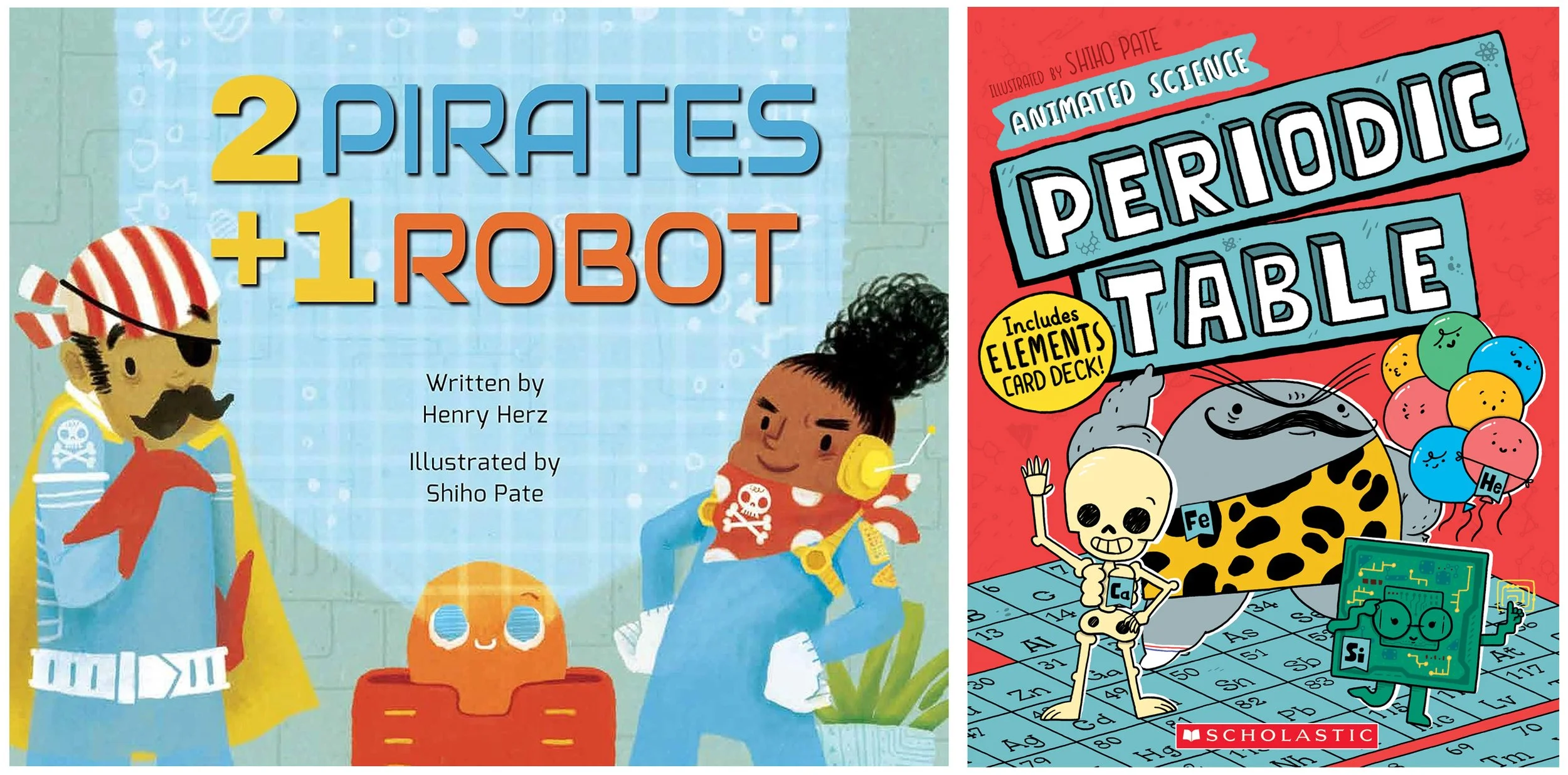
I think style means voice. And that’s how I expanded my portfolio. Both in 2 PIRATES + 1 ROBOT and ANIMATED SCIENCE : PERIODIC TABLE, my characters are expressive, goofy, cheeky and caring. I want to create books so kids can escape and immerse themselves. And these book projects aligned with my goal, my voice.

Of course I had to do art tests on some of the book projects to prove to the editors that I can do the job. My agent helped me a lot because my agent is a legend (<3 you Deborah! ) and editors trusts her. So they trust me.

I kept developing and tweaking my portfolio to gain confidence from new editors. Maybe they like my humor. Maybe they like my character designs. Maybe it’s the color choices. Maybe they have heard about my work ethic. In the end I think (I hope) I get a call because they trust my agent and they like my voice.

Explore : What’s next

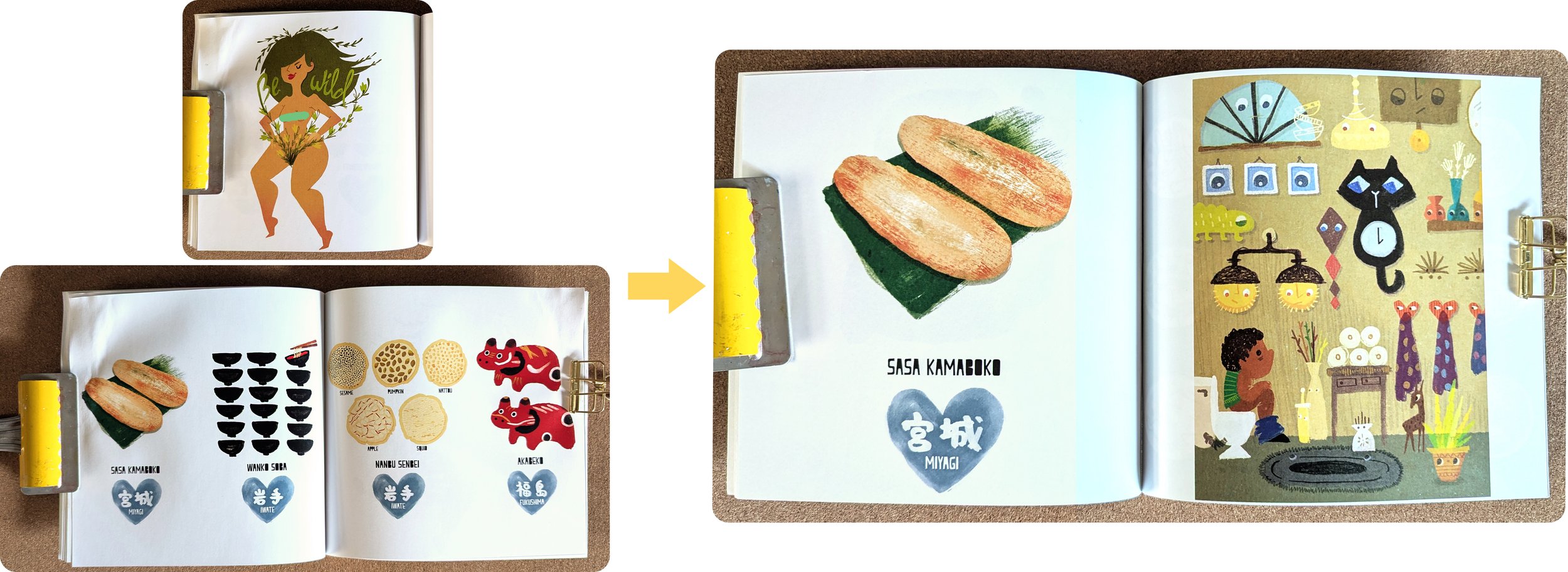
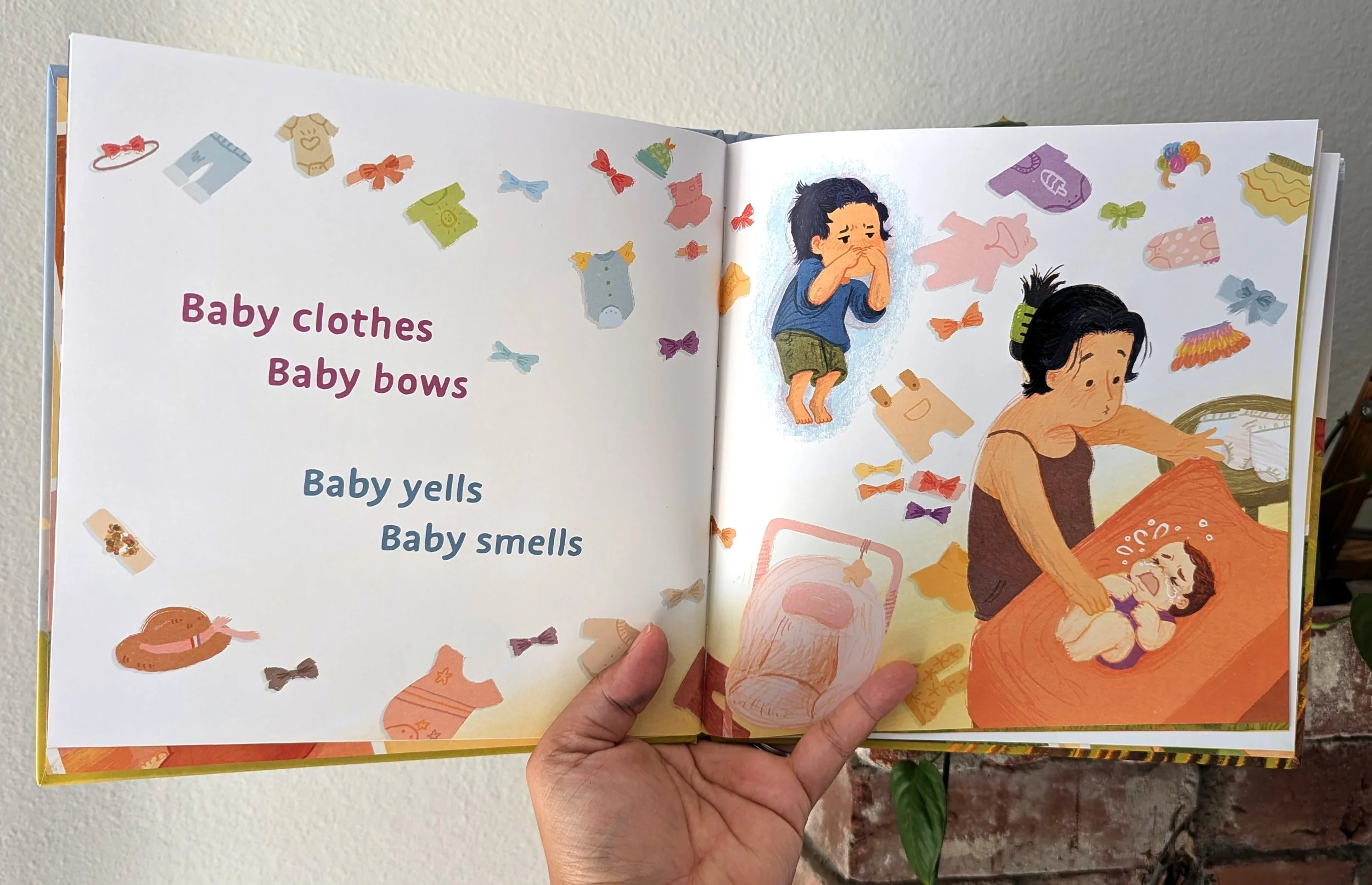
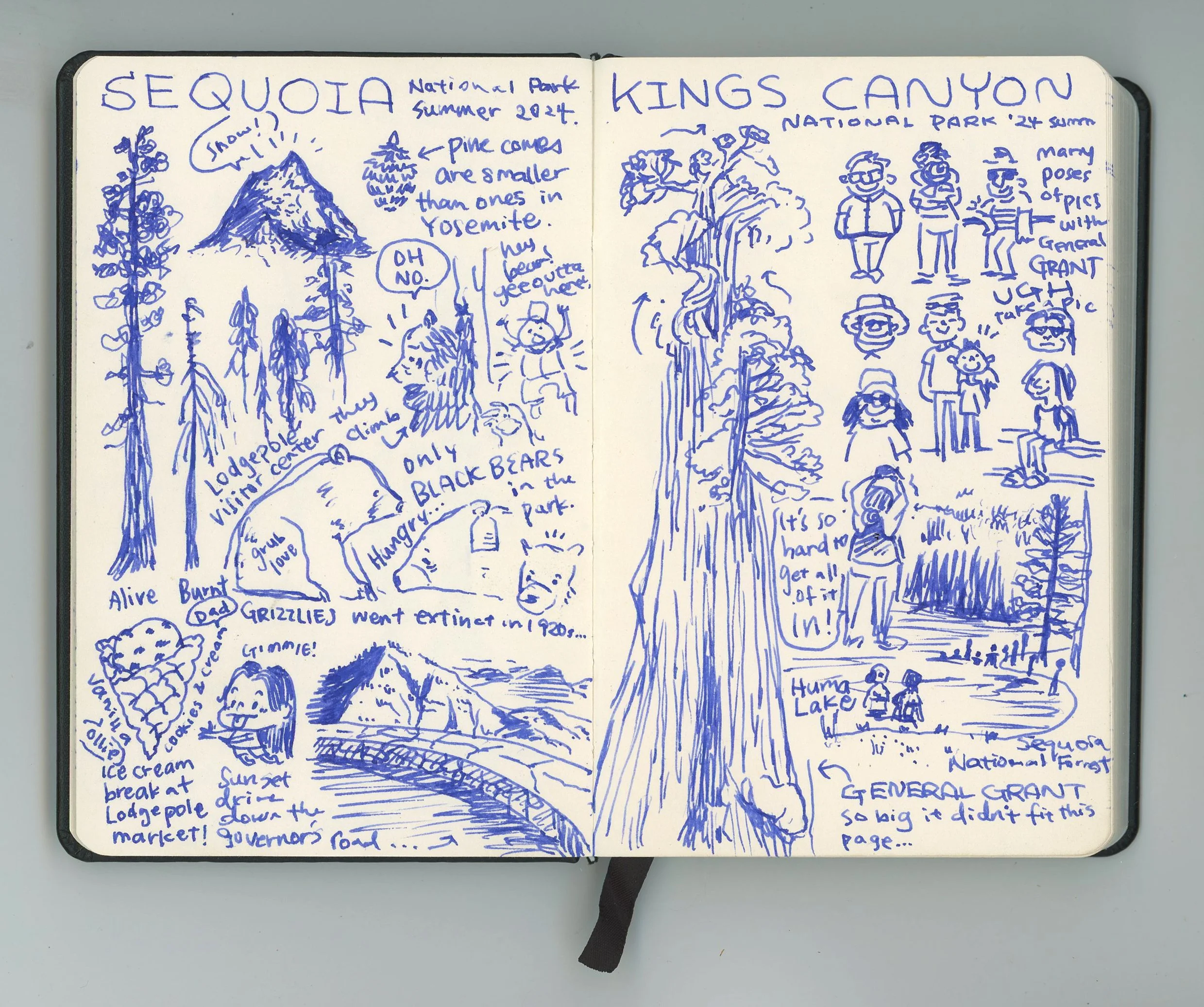
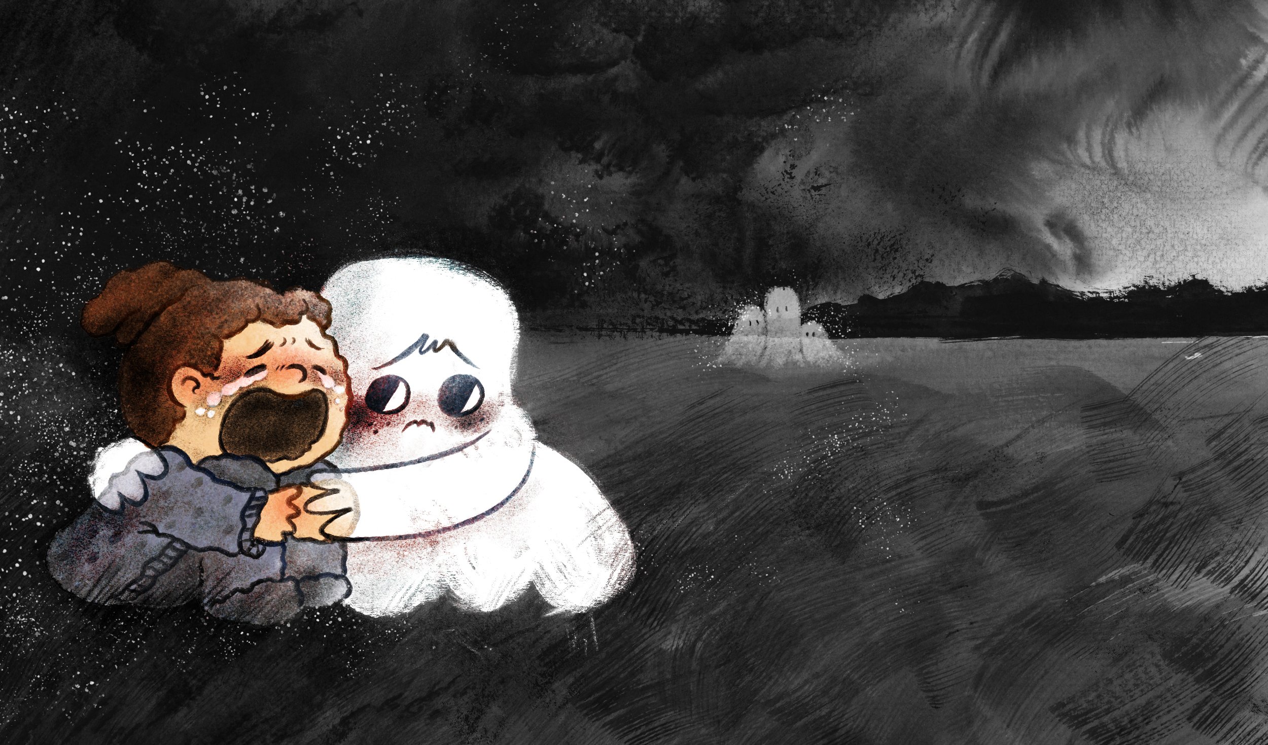
Now that I have multiple books published my portfolio is perfect right? Nope. Not at all. I still have so many stories I want to illustrate. How I feel is constantly changing. My brand is morphing. Expanding. I’m trying to update my portfolio every three months. I still get portfolio critiques by kidlit friends. I go to lectures and meetups to learn. I’ve started sending physical postcards. I’m writing my blog more often. I’m on Bluesky and Instagram. I participate in hashtags like #KidlitArtPostcard and #PortfolioDay on social media. Illustration below is the latest portfolio piece. I did this because my portfolio lacked variety in emotions. I wanted to use sumi ink more. And to be super honest that’s how I was feeling.

This is all just my opinion. This is not a guidebook. I’ve seen artists like Marissa Valdez having a more concrete technique on developing your own style. If you ever have a chance to see Marissa talk, don’t sleep on it. It’s incredible.

Thank you so much for reading. See you next month <3

Love and timid feelings, Shiho

Which illustration got me the book job?

We often talk about what to put in a portfolio but we rarely talk about which illustrations gets the job. I was always curious about this. Us illustrators put so much effort into promoting outselves. We use unstable social media and post our art that might get stolen. We put our own money into making and sending postcards. We go to conferences and try to connect with others. All in hopes of editors and art directors noticing us. But which illustrations truly catches their heart? Let’s talk about it.

Case No. 1 : I asked my editor

When I worked on RAMEN FOR EVERYONE (ATHENEUM, SIMON & SCHUSTER) I got to do a presentation with her for Junior Library Guild. It was a super rare opportunity so I asked THE question. “Which of my illustration made you hire me?“

My editor said the illustration to the right. I was surprised. RAMEN FOR EVERYONE is about food. So I assumed she had to see my food illustrations. But then I remembered the book is also about family love. It’s about dad and a son working and respecting each other in the kitchen. Then it hit me.

I created the illustration above because I missed my home. This was my home in Japan. The kitchen counter had a fax machine. It was also where I would peak into my mom making dinner. I was probably really hungry so I hoped my mom would let me eat a “sample“ or “end bits“ of whatever she was making.

I would often ask “is there anything I can help with?“. My mom usually replied with “you watching is the most important job“ so I believed her. My dad was never home. She was probably lonely. I was lonely. So Spending time together even though we didn’t talk much helped. I poured all of that nostalgic, mixed emotions into this illustration.

So for my editor to pick this illustration made sense. I never talked in detail about the meaning of the illusration above. But I felt like I was seen and trusted.

Case No 2 : I did an art test

ANIMATED SCIENCE : PERIODIC TABLE (SCHOLASTIC) almost didn’t happen. I got an email about it from my agent. Then nothing happened for few months. Then suddenly they asked me to do an art test. The book was made during the pandemic so nothing was certain. So I understood and quickly went to work.

What is an Art Test? Great question! I often did them when I was applying for jobs as a game artist. After the (usually) face to face interviews, I often had to do art tests. Sometimes I was asked to redesign a UI layout. Other times it was redesigning the flow of the UI.

So when the editor asked me to do an art test for the book, I treated it similarly to a game art test. They wanted me to design two characters based on the description. It was IRON and CARBON. The description was simple. They gave me a scientific description and a character description. Iron is a common metal but strong so maybe a strongman. Carbon is a diamond so maybe a flashy condifent one? Now GO!

So i sent the pencil sketches above. And I made sure I was neat and simple with the presentation. Think about it. Editors are BUSY. They probably are looking at art from multiple artists a day. And they have to respond pretty quickly so they wouldn’t be the one holding up the process. So what do they want? Simple, organized and eay to read information. Here’s what I paid attention to when I was organizing my character sketches.

  1. Each character style was in pairs. So if you compare each Iron and Carbon character, each vertical row showcases a style (similar proportion, facial features, even sometimes attitudes)

  2. All of the characters are in one line

  3. Character type is labeled

  4. Characters are numbered at the bottom

By doing these things, it helps with smooth communication. My editor got back to me pretty quickly and wrote “I like the Iron row 3, Carbon row 1. But can you make it more strong? Can I see a color sample too?”

So I created color samples (see above). See how easy it was for the editor to communicate with me? Making book is a team effort. I personally love to put in effort like this.

Case No 3 : Editor asked for me

I love when the editor asks for me. I love it even more when they describe why they are asking for me. This is the email my agent forwarded me when she started talking about BABY STEPS (ABRAMS APPLESEED). The editor wrote,

“We love the warmth, humor, and rich colors in her art, not to mention the amazing way she captures emotional connections between her characters.“

See so many buzz words? My illustrations are warm. Funny. Rich colors. Captures emotional connection. WOW. I might have to put this in my bio now.

Feedback like this is super helpful. We don’t get these unless we ask (or pay) for a critique. When I started working on my portfolio, I thought about what kind of books I want to make. I wanted to create a space for kids to escape and immerse themselves. That meant comfort. Fun. Adventurous. Feel the feels. Isn’t it pretty close to what the editor wrote? I did a mini celebration ice cream break that day <3

Here’s an example of how amazing my agent is! When we got the email above, I replied to my agent with a YES I’m interested. So my agent replied to the editor with that news. But here’s the extra magic she puts in. She included the image to the left. She didn’t have to do that. Editor was already excited about my work. But just to make the whole process more exciting and inviting, my agent puts in images like this.

I didn’t make this image. It was another interesting “report card“ I accidentally got. This image shows what my agent thinks interesting about me. It includes gallery work, wood workings, murals I did for a children’s museum, books I worked on and a portfolio piece. It showed me that my agent sees everything I do everywhere (website / social media).

Here’s three examples of how I got my book jobs. I hope it was useful. Hopeful?

My agent is not the only one responsible for promoting my work. I am still figuring it out. For example, I started sending physical postcards again! I am nervous. But also so excited. There’s no one right way to spread the word. But I believe that at least I have to continue talking about my work. Because I’m excited to work on books. I want to make more spaces for kids to escape and immerse. Thank you for reading. See you next month <3

Love and timid feelings, Shiho

How did I get book deal? Fine tuning my PORTFOLIO

2025 is special because my 10th children’s book will be released this year! I feel so lucky. When I feel lucky I have the urge to pay it forward. The number one question I get as a children’s book illustator is “how do you get book deals?“ and you’re right, kidlit industry is such a mystery. Honestly there’s no single straight path. But let’s try to peal the layers as much as possible. This month I’m sharing my PORTFOLIO journey.

Self publishing vs traditional publishing

Before I start talking about my portfolio I want to quickly recap two basic paths illustrators can take when making children’s books. First one is self publishing which I haven’t done yet. Self publishing means that you and your author does everything. Second one is traditional publishing which is how I work. Here’s a super basic info about them.

Traditional Publishing

  • My agent negotiates my $, my rights, my schedule etc with the publisher

    • My agent is great at thinking about things such as royalties, international rights, media rights, use on AI etc.

    • I usually have an advance which means I get paid in chunks throughout the book making process. If I “earn out“ the advance, then I start to get paid in royalties.

  • The publisher provies a team of experts when making the book

    • Art directors, book designers, editors, marketing team etc

  • The publisher prints the book

  • The publisher promotes the book

    • Chances to get the book promoted on their social media platform

    • Chances to get the book distributed via Scholastic book fair, school libraries etc

    • Chances to get invited to national events such as ALA conference

Self Publishing

  • You negotiate your $$$

    • You will be negotiating with (usually) your author about how you will get paid. If it a flat fee? Royalty? Per hour? The good thing is if you negotiate well, you earn all of the $$ you make from selling the book.

  • You negotiate your rights

    • You and (usually) your author will come up with a plan on who owns what and how

  • You make the book in your own schedule

  • You print the book

  • You promote your book

    • You and your author will be promoting your book. I’ve seen driven authors doing so many school visits and book festivals.


Which one do you prefer? There’s no wrong answer and both can be super successful! I went with the traditional publishing because I’m not good at negotiating. I need to rely on a team when I’m creating a book.

Both path requires some kind of portfolio. Whoever hires you needs to see your work. You need to earn their trust.

My portfolio journey : the beginning

So you picked a path. But you don’t know where to start? Yep, I was there too. I was working as a full time game artist when I started thinking about expanding my path to making children’s books. I went o 3x3 magazine conferences. I had my illustrations critiqued by art directors and illustrators. I even made a book dummy. But nothing clicked until I asked an illustrator who already had published books.

I am forever thankful for that lunch. This illustrator (not sure if he/she wants to be named so keeping it private) gave me the best tips on what to prepare and how to prepare it. That lunch led my to my agent who gave me even more specific tips.

So here are things I did wrong and how I improved it.

The book on the left is the physical portfolio / booklet I handed out. The book on the right is the one I made after I met my illustrator mentor and my agent. Similar right? But the one on the right has more movement, a sense of direction. A hint of mixed emotions rather than a singular happy face. Then there’s a subtle story. It makes you wonder. Is the bunny going to a party? Or coming home from one? Why does she have so many balloons? Why is she not so colorful?

I still had a game artist’s brain so I thought I had to create a “nice looking illustration“. I was thinking of asset art which I love making. But no one cared for these kinds of illustrations. Why? Because there’s no story. Just looking nice wasn’t good enough to gain art director and editor’s trust.

I thought I had to incorporate text because well… I wanted to be hired as a children’s book illustrator. And it’s common for children’s books to have text. So I included texts in my portfolio. A cheeky pun perhaps? I was wrong again! My agent said the illustration on the right is way better. Why? Because it has a sense of story. Again, you start to wonder. On top of that I drew my own text. Yes I LOVE hand lettering. Showcasing what you want to be hired for is important. With the illustration on the right I got to show that I love story, humor, hand lettering and characters.

Oof this is an embarrasing one. I thought showcasing my voice was important. But how I did it was wrong. I am all for women empowerment. But as you can see in the illustration at the left, I had some not so clothed figure. I think there’s an appropriate time and place for that. But it didn’t need to exist in portfolios. The surprising thing was that the illustration at the right with the boy in the bathroom was received very well. What’s the difference? People related to it. Some kids are afraid of pooping. Afraid to use the restroom. I’m glad I learned this lesson early in my career.

One of my big request my agent had was to zoom in on what I represent. I am Japanese. I was born there and spent half of my life in Japan. I illustrated local food and culture from Tohoku region when the big tsunami hit Japan. I was sharing it on my social media so people would be interested in visiting the Tohoku region. My uncle lives there and my heart was breaking. I wanted to help. When my agent heard that back story she asked me to use more pages on those illustrations. Personal stories are important. Illustrate it, express it.

So was my portfolio a complete disaster? Well, no. The illustrations above was successful in drawing in agents and editors. I kept those in my portfolio for a while. These were successful because it as a story. Depth. A point of view. A sense of who Shiho Pate is as an illustrator.

That booklet led to my first book deal. I’m so thankful for the community that helped fine tune my portfolio.

Since then I’ve lost count on how many illustrations I’ve created. I started posting more on my social media (mainly instagram). I updated my website frequently. Thank you squarespace for making it so easy to do that!

My portfolio Now

Do you see any of the illustrations I shared above in my current portfolio? No. Because you want to keep creating. You want to be puting your best work up front.

There are old illustrations I want to recreate. But for now I am focusing on creating illustrations that speaks to my heart. What I want to say. Stories I want to tell.

Right now I have my portfolio separated into two categories. One is FULL RENDER and the other is SIMPLE LINES. I did this because I had two very different look.

But again I’m constantly evolving. So who knows how my portfolio will be structured in the future… :)

Wow that was long! Lastly, I want to share the illustrators who have an amazing portfolio websites. I LOOOOVE it when the artists showcases their brand (logo, font, color, structure etc). Do you have a favorite?

Next month I will be sharing the illustrations I did that got me book deals. Yes I’ve done art tests. Yes I’ve created illustrations with book projects in mind. Sorry for the potential misspelling and poor sentence structure. I treat this like a hand written letter to you. If you want me to write about a specific topic please leave a comment below. Thank you for stopping by <3

Love and timid feelings, Shiho

Making of the picture book BABY STEPS

BABY STEPS is coming out in less than a month!

Baby stands / Baby lands
Baby falls / Baby bawls
Brother cuddles / Brother snuggles
Brother clasps / Baby grasps

Follow along as a young boy becomes a big brother and experiences the new noises, smells, and “firsts” a baby sibling can bring, including baby’s first steps! With simple, sweet rhyming text—and stunning, full-color illustrations—this book is an ode to siblings everywhere.

Kimberly Derting wrote this simple and sweet rhyming story and I had the best time illustrating it! Here’s how I made this book with lovely ABRAMS APPLESEED team.

First steps : Who are they?

The “challenge“ I had this story was the simplicity of the text. As you can see below the simplicity of the text allowed me to explore and expand. It was up to me to figure out who the story is about.

So I got to work. I started with doodling the brother because the story is from his point of view. The story didn’t give the brother a name so I named him which helped me imagine. Meet Jun.

Then I wrote down what his personality might be. What his likes and don’t likes are. Even gave him a little scar on his eyebrows and how that happened. Writing it down helped me figure out how he might move, how he might express himself and most importantly how he changes after his baby sister arrives.

Next was Saya, Jun’s baby sister. From the story I imagined her to be more outgoing than Jun. The story’s highlight is when Saya takes her first step. To get to that, I wanted Saya to be the active type that wants to just go go go. And always rely on Jun to help her out.

It was also very important to practice drawing Saya from a newborn to a toddler. I gathered my daughter’s photos. I looked at my sister’s kid. And I sketched my friend’s kids. Yes it truly takes a village <3

Then it was mom and dad’s turn. It took a bit to figure out mom’s personality and looks. I had a difficult portpartum period. People say to always draw from my heart. But I didn’t want to express that difficult time in this book. I did however tried to be honest about it in her looks. In the first few pages, mom’s hair and clothes are a bit messy. Her expressions are a bit tired. Even though it’s not written in the story, I wanted to make sure I paid extra love to the parents.

I sent the sketches above to my editor. She didn’t ask for it. But I wanted to make sure how I thought about the characters were in line with what they imagined. I’m glad I share it because I got a “this looks great!“ email back :)

My editor wanted to see color and treatment examples. So I put together the illustrations below. I wanted to be heavy on the pencil lines for this book because the story had so much fun energy. I got a speedy approval on these so YAY!

Thumbnails, sketches and everything nice

After the character design approval I moved onto thumbnail sketching. I learned this step in art school. Thumbnail sketches are basically tiny loose doodles. It’s usually used to figure out composition and flow of the story. I use index cards so I won’t be precious with it. I can also easily swap the pages or do multiple versions of a particular spread (see below).

I fold the intex card in half so to remember the folds in the book. You never want anything imporant in the middle.

Final steps : Illustrations and hand lettering

I don’t show my thumbnail sketches to my editor. But I do share my sketches. Below are some examples. Notice how I still experiment with composition.

My editor and I went back and forth on the sketches. Then we realized the brother looked a bit older than we wanted. My editor mentioned maybe it was the hair. I was kind of attached to the middle parted hair so I kept it but make it shorter. I also adjusted his proportion and added more cheeks.

I love this part of the process because I get to collaborate with the team and really figure out how to make the best book together.

I also got to do some hand lettering in this book! I was SO EXCITED! And in the parts where my hand lettering wasn’t used, ABRAMS team did an amazing job finding fonts that was close to my hand lettering.

So there you have it! I am so excited to share this book with you next month! BABY STEPS is a great book to read with your kids, kids to read to their younger siblings and gifts for kids! I put a lot of love into this book (and fun easter eggs on the end papers ;) ). If you have any quesitons about the process or about the book, please comment on this post <3

Hello because I miss you (aka social media is unstable)

I’m restarting my blog! Yep, I used to have a blog way back in 2015. I wrote about my life as a game artist. But since them I’ve switched (expanded?) my career as a children’s book illustrator. So I thought this would be a great clean restart. Welcome, thank you for joining me.

So why a blog now…?

I’ve been wanting to do this for a while. I love connecting with my community. I love giving back (if there’s any). But until now, social media especially my Instagram has been a great place for that. I would share my illustrations as posts. And share my personal life in stories. I love the comments and DMs from you. But Meta started training their AI with images from my posts, and there’s no way to opt out (at least in USA), I had to stop posting my illustrations. It was sad. But it was more heartbreaking to possibly lose the connections and interactions with you…

What will I share here then?

To be honest I’m not sure. I loved getting instant reactions from you when I was connecting on Instagram. I loved polling and asking questions about what YOU wanted to see. I miss that… So. May I please ask you? I’ve created a form below. I would love to hear from you :)

Thank you so much for being here. My writing is probably messy, misspelled, and full of run-on sentences. So I appreciate your patience and curiosity <3